What a candlestick chart is
A candlestick chart is a way of drawing price data. Each candle covers a period (a minute, an hour, a day) and encodes four numbers: open, close, high, low. The body spans open to close; the wicks mark the extremes touched during that period.
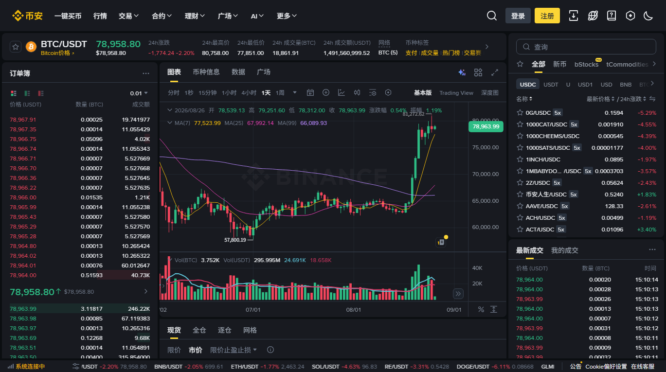
One uncontroversial fact to start with: a candlestick chart isn't a theory. It's a way of arranging trades that already happened. What's contested is the apparatus built on top of it — technical analysis.
The case for
Stated fairly, and in full:
- It is a complete record of market behaviour. Price and volume aggregate what every participant actually did, which is more honest than what anyone says.
- Some patterns may be partly self-fulfilling. When enough participants place stops or orders at the same level, that level genuinely produces buying or selling pressure. That's a mechanical, comprehensible reason — nothing to do with shapes having power.
- It supplies a discipline framework. For some people, rules defined in advance (under condition X, do Y) are more controllable than deciding in the moment. That value comes from having rules, not necessarily from the rules being correct.
- It keeps attention on observable things rather than unverifiable rumour.
The case against
- The data has one dimension. A chart contains price and volume and nothing from the four layers — no leverage level, no capital flows, no structural events. Explaining a multi-dimensional system with one dimension is short of information by construction.
- Pattern recognition is highly subjective. Given the same chart, different people draw different trendlines and see different formations. A method without objective criteria is difficult to test rigorously.
- Survivorship bias is severe. Successful examples get displayed repeatedly; failures vanish quietly. And on a historical chart every signal looks obvious — because you already know what came next.
- Academic findings remain divided, and many methods reported as effective weaken substantially once transaction costs and data-mining bias are accounted for.
- Parameters can be adjusted indefinitely. When an indicator fails, change the period, change the settings, add a filter. A method that can be tuned without limit to fit the past says nothing credible about the future.
Why beginners become overconfident here
This is what the article actually wants to say. Technical analysis carries a specific danger for beginners, for four reasons that have nothing to do with whether it works:
1. The learning curve looks deceptively flat
The names of patterns and indicators are quick to learn, so the feeling of “I can read this chart” arrives very fast. The distance between knowing the vocabulary and making useful judgements is much larger than that feeling suggests.
2. Hindsight manufactures a powerful illusion
Open any historical chart and you can immediately point out where to buy and where to sell. But you're doing it with the outcome known. Mistaking that sensation for skill is the most common form of self-deception here. The test: cover the right half of the chart and make the call again.
3. It gives emotional decisions a technical costume
Price falls, you open a chart, find a “breakdown”, and sell. The chain sounds professional, but what actually drove the decision was fear and the chart supplied the after-the-fact justification. In why “sentiment improved” explains nothing this appears as “using a freshly learned framework to rationalise an emotion”.
4. It easily becomes a reason to trade often
There is always a signal somewhere on a chart — switch from daily candles to five-minute candles and the number of signals multiplies. And every trade costs something, which is the one cash outflow that is completely certain to occur.
We teach no indicators, offer no pattern readings, and take no position on whether technical analysis works — that exceeds what we can answer honestly. The purpose of this article is narrow: before you decide whether to invest time in learning it, know what the arguments on both sides are, and where the beginner-specific traps sit.
If your goal is to understand why it moved
Then a chart isn't the most effective tool, because it contains only price. The four layers this site cares about need data from outside the price series: open interest and funding rates (leverage), cross-market co-movement (macro), official notices and on-chain records (structural events), supply and balance trends (supply).
All of it is free to look up, and the layer explorer tells you where to find each one.
Common questions
Do predictive patterns exist or not?
We don't render a verdict — answering it properly requires rigorous statistical testing, and the existing literature is divided. What can be said: any claim of “reliably effective” that comes with a fee should be asked for independently reproducible evidence, and that evidence is almost never produced.
I already use technical analysis. Is this article attacking me?
No. It doesn't say the approach is ineffective — it says testing it is hard and points out where beginners overestimate themselves. If you have predefined rules, keep records, review them, and understand that your method has never been rigorously tested, you're being more honest than most people.
Why not teach a few basic indicators?
Because once you start teaching, you have to answer “when do I use it and what settings”, and we have no basis for answering that. Half-taught technical analysis is more dangerous than none — it supplies enough confidence to act without enough judgement to evaluate.